Quantcast
Channel: Joyful Public Speaking (from fear to joy)
Viewing all 2131 articles
Browse latest View live

YouGov survey of British adults found they most commonly were very afraid of heights, snakes, public speaking, spiders, and being closed in a small space

$
0
0


On March 20, 2014 YouGov plc posted an article by William Jordan titled Afraid of Heights? You’re Not Alone with the results of their fears survey just done in Britain on a sample of 2088 adults (1075 women and 1013 men). Those people were asked about the following 13 different fearful situations:

Being in a closed space
Blood
Clowns,
Crowds
Darkness
Dogs 

Flying in an airplane
Heights
Mice
Needles and getting shots
Public speaking
Snakes
Spiders


They were asked if they were:

A) Not afraid at all
B) Not really afraid
C) A little afraid
D) Very afraid


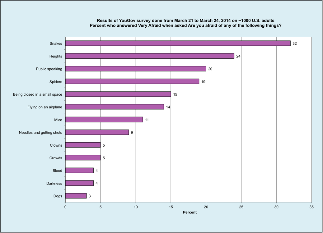
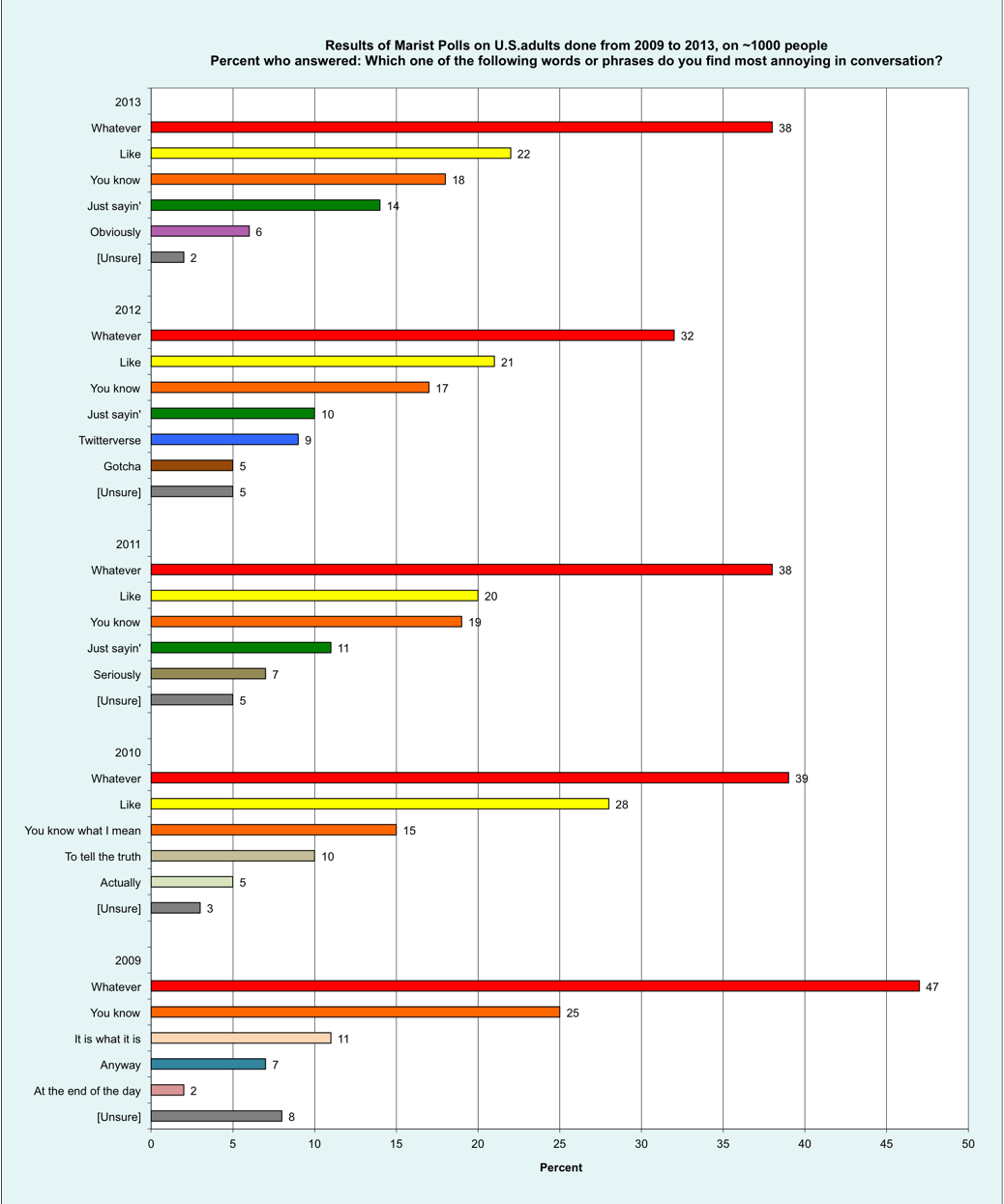
Results for Very Afraid are shown above in a bar chart. (Click on it for a larger, clearer view). The top five fears are:

Heights (23%)
Snakes (21%)
Public speaking (20%)
Spiders (18%)
Being closed in a small space (14%)


For Very Afraid, women and men have rather different fears, as shown above in a second bar chart. For women the top five fears are:

Snakes (28%)
Public speaking (27%)
Heights (26%)
Spiders (25%)
Being closed in a small space (19%)


For men the top five fears [and difference re women] are:

Heights (21%) [-5]
Snakes (14%) [ -14]
Public speaking (13%) [-14]
Spiders (12%) [-13]
Being closed in a small space (10%) [-9 ]


Heights came in first, followed by snakes. Note that public speaking came in third overall, and second for both women and men, contradicting the often seen claim that it always ranks first. At least twice as many women as men were scared of snakes, public speaking, spiders, mice, and darkness.    


Results for A Little Afraid are shown above in a third bar chart. The top five fears are:

Public speaking (36%)
Heights (35%)
Snakes (31%)
Being closed in a small space (29%)
Spiders (24%)


For A Little Afraid, women and men also have rather different fears, as shown above in a fourth bar chart. For women the top five fears are:

Heights and Public speaking, tied (37%)
Being closed in a small space (33%)
Snakes (28%)
Spiders (27%)
Crowds and Mice, tied (22%)


For men the top five fears [and difference re women] are:

Public speaking (35%) [-2]
Snakes (34%) [6]
Heights (33%) [-4]
Being closed in a small space (24%) [-9 ]
Spiders (21%) [-6]


At least twice as many women as men were scared of crowds, mice, and darkness.
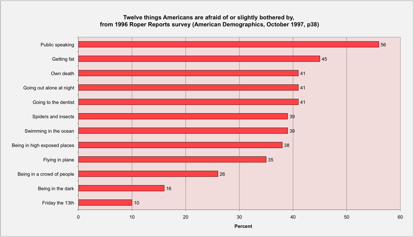


We also can add the percentages for A Little Afraid to those for Very Afraid to produce impressively large percentages for Total Afraid, as shown above in a fifth bar chart. Now the top five fears are:

Heights (58%)
Public speaking (56%)
Snakes (52%)
Being closed in a small space (43%)
Spiders (42%)


For Total Afraid, women and men also have rather different fears, as shown above in a sixth bar chart. For women the top five fears are:

Public speaking (64%)
Heights (63%)
Snakes (56%)
Being closed in a small space and Spiders, a tie (52%)
Mice (34%)


For men the top five fears [and difference re women] are:

Heights (54%) [-9]
Public speaking and Snakes, a tie (48%) [-16 and -8]
Being closed in a small space (34%) [-18 ]
Spiders (33%) [-19]
Needles and getting shots (26%) [2]


At least twice as many women as men were scared of mice, and darkness. As the article noted, the largest gender difference [19%] was for Spiders, a third (33%) for men versus more than half (52%) for women.

The article presented just one stacked bar chart with overall percentages, but provided a link to tables with detailed results. I’ve just discussed gender, but also could have shown age and geographical region. 

The image of a high London Eye Ferris wheel cabin is from Wikimedia Commons.


Crimeria? Really?

$
0
0


On his early-morning 580 KIDO AM talk show today I heard Kevin Miller repeatedly refer to Vladimir Putin and the Russian Army having taken over Crimeria. I was both amused and appalled by his lack of preparation.

Crimeria might exist somewhere in a Batman comic book. Perhaps it’s where they lost the War on Crime. But, Crimea is real. From 1853 to 1856 there was a Crimean War that included the Battle of Balaclava and the Charge of the Light Brigade. Getting the name wrong is a credibility destroyer.


Balaclava later became a common term referring to a type of headgear. I hope Kevin just calls that a ski mask, rather than a bataclava.

The balaclava image came from Per Erik Strandberg at Wikimedia Commons.

A Turducken Infographic from the Idaho Statesman

$
0
0


The front page of last Sunday’s Idaho Statesman had an article titled Idaho colleges aim for higher tuition, again with a curious infographic. It both tabulated and plotted how tuition at Boise State University increased 79 percent from $3,520 in 2003 to $6,292 in 2013. That data is shown above in a conventional line chart, with the y-axis starting from zero, which is an honest way of plotting.

The Statesman decided white space on their front page was too valuable to waste, so they instead cut off the bottom of their graphic just below $3000. Why did I call it a turducken? A turducken is a 3-in-1 deboned fowl mashup consisting of a chicken stuffed inside a duck, stuffed inside a turkey.    

Their graphic plotted the data as a blue line chart, with the value for each blue-circled  data point labeled beside it. Beneath the values for even-numbered years are orange bars, and beneath the values for odd-numbered years are tan bars.

So, first their graphic is equivalent to a table (the chicken). Second, it’s a tiger-striped bar chart (the duck). Third, it’s a line chart (the turkey). It’s clever, but somewhat misleading.

The Misleading Graph page at Wikipedia says that one with a Y-axis that doesn’t start at zero is a truncated or torn graph.

On page 56 of Edward Tufte’s book The Visual Display of Quantitative Information (2nd edition, 2001) he states two principles of graphical integrity:

“The representation of numbers, as physically measured on the surface of the graphic itself, should be directly proportional to the numerical quantities represented.

Clear, detailed, and thorough labeling should be used to defeat graphical distortions  and ambiguity. Write out explanations of the data on the graphic itself. Label important events in the data.”


On the next page Tufte defines a Lie Factor:

“Lie Factor = (size of effect shown in graphic)/(size of effect in data)”

and says if the Lie Factor is less than 0.95 or greater than 1.05 the graphic isn’t accurately representing the underlying numbers. The Stateman’s truncated graphic has a Lie Factor of about 0.57, which is pretty misleading.

Learning to Recognize Fallacies and Bad Arguments

$
0
0


When you write a speech, you should avoid logical fallacies and other bad arguments. Wikipedia has a page with a long List of Fallacies. Also, last January I blogged about An Infographic Showing Rhetorical Fallacies.

Recently online I found An Illustrated Book of Bad Arguments by Ali Almossawi, which has amusing cartoons about this serious topic.

Five bad arguments came up before the last presidential election, as was discussed by Scott Neuman in A Guide to Spotting Pretzel Logic on the Campaign Trail. Both Barack Obama and Mitt Romney graduated from the Harvard Law School, so their campaigns also should have known better.


In March 2008 Paul Graham posted an essay on How to Disagree that listed a hierarchy which was linked to by the CreateDebate blog and illustrated  with a pyramid, as shown above.

The image of two arguing men was derived from an old Federal Art Project poster about More Courtesy

Survey by Molly Maid found that 44% of U.S. homeowners would rather speak in front of a large group than clean their home

$
0
0


On March 26th a cleaning company based in Ann Arbor Michigan issued a press release titled Molly Maid Survey Reveals Majority of Homeowners Won’t Spring Clean. Their survey of over 2000 people also redundantly reported that rather than clean their home 44% would rather speak in front of a large group, and 30% would rather go on a six-hour car ride with their in-laws.


Why did I say redundantly? Because, as shown above in a bar chart, 93% said they would rather do anything else than clean their home. That’s an impressive level of disdain!  The Molly Maid Anonymous Cleaning Confessions Survey was done on SurveyMonkey from February 5th to 14th. Apparently no one said that they’d rather eat a bowl of dog food than clean, or that there was nothing they’d rather do than clean, since they love cleaning.

The 1870 image of a young housekeeper and her mother dusting the parlor came from the Library of Congress.

Sorry, but Zero Gravity Day just is an old April Fool’s Day joke

$
0
0


Over on News Hound Sarah Morris posted an extremely silly article titled April 4th 2014 Planetary Alignment Decreases Gravity - Float for 5 Minutes! #Zerogday. She absurdly claimed that:

“...if you jump in the air at 9:47 AM local time on April 4th 2014, it should take you about 3 seconds to land back on your feet instead of the usual 0.2 seconds.”

Sarah claimed this had been revealed by the British astronomer Patrick Moore. Well, sort of. Ten seconds of research at Wikipedia will show you that Patrick Moore died back on December 9, 2012. He’s pushing up daisies, and is not revealing anything.

I read about this silly article on Phil Plait’s Bad Astronomy blog, in a post he titled: No, April 4, 2014 is NOT “Zero G Day.” No.

When you look on either Snopes or at the Museum of Hoaxes you’ll find the nonsense just was an April Fool’s Day joke done by Patrick Moore way back in 1976! It has been popping up again ever since.

If you stay on the News Hound page for a while you will get a pop-up ad saying to:

“Please Share This Page
We rely on word of mouth. 
Take a moment to share this with your friends (on Facebook).”

Please don’t share it! It's absolute rubbish!

The image of Clayton Anderson floating while on the International Space Station is from Wikimedia Commons.

Goodbye Glossophobia - an April Fool’s Day satire

$
0
0


Yesterday evening on the Huff Post Comedy Blog John Malik posted an April Fool’s Day article titled Goodbye Glossophobia. He described a fanciful new anxiolytic drug called Extrovertialis that briefly could make a speaker as confident as the legendary Theodore Roosevelt.


I’ve shown above how a marketing campaign would arrange some of those lurid purple pills in a letter formation. John cautioned that possible side effects for Extrovertialis include:

"...impressions of arrogance, conjunctionitis, mild incontinence, temporary blindness, potentially fatal levels of conceit and an occasional night sweat.”

Bully! The 1907 stereograph image of Teddy speaking came from the Library of Congress.


YouGov survey of U.S. adults found they most commonly were very afraid of snakes, heights, public speaking, spiders, and being closed in a small space

$
0
0


If you were thinking about referring to a fears survey published in the 1977 Book of Lists that really came from a Bruskin survey way back in 1973, please stop. Why not update to one from 2014?

On March 27, 2014 YouGov plc posted an article by Peter Moore mistitled Argh! Snakes! America’s Top Phobias Revealed with the results of their fears survey just done in the U.S. on a sample of about 1000 adults. Those people were asked about the following 13 different fearful situations:

Being in a closed space
Blood
Clowns
Crowds
Darkness
Dogs
Flying in an airplane
Heights
Mice
Needles and getting shots
Public speaking
Snakes
Spiders


They were asked if they were:

A) Not afraid at all
B) Not really afraid
C) A little afraid
D) Very afraid


Back in October 2011 I blogged about the clinical definition for What’s the difference between a fear and a phobia? A phobia calls for more than being very afraid, so these really just are fears.


Results for Very Afraid are shown above in a bar chart. (Click on it to see a larger, clearer view). The top five fears are:

1. Snakes (32%)
2. Heights (24%)
3. Public speaking (20%)
4. Spiders (19%)
5. Being closed in a small space (15%)


The most common fear, snakes, was consistent with the 2001 and 1998 Gallup Polls. Note that public speaking came in third, contradicting the often seen claim that it always ranks first. To see if a difference is significant, we need to compare it with the margin of error, which for Snakes (991 people) and 95% confidence is 3.1.%. (95% confidence means there is only a 1 in 20 chance that the difference would be this large).


Results for A Little Afraid are shown above in a second bar chart. Now the top five fears are:

1. Public speaking (36%)
2. Heights (33%)
3. Snakes (32%)
4. Spiders (29%)
5. Being closed in a small space (27%)


We also can add the percentages for A Little Afraid to those for Very Afraid to produce impressively large percentages for Total Afraid, as shown above in a third bar chart. The top five fears are:

1. Snakes (64%)
2. Heights (57%)
3. Public speaking (56%)
4. Spiders (48%)
5. Being closed in a small space (42%)


Note that for the total the order is the same as for Very Afraid, and fear of public speaking drops back to third place.

Detailed results also were provided in an Acrobat .pdf file which you can download. They tabulated them with the following categories:

Gender (Female or Male)
Party ID (Democrat, Independent, Republican)
Race, which should be ethnicity (Black, Hispanic, White)
Age (18-29, 30-44-45-64,65+)
Family Income $ thousands (Under 40, 40-80, 80-100, 100+)
Region (Northeast, Midwest, South, West)


Today I’ll just discuss those for gender. The sample for Snakes 517 women and 474 men. To see if a difference is significant, we need to compare it with the margin of error, which for 474 and 95% confidence is 4.5%.


For Very Afraid, women and men have rather different fears, as shown above in a fourth bar chart (sorted by rank for women). For women the top five fears are:

1. Snakes (44%)
2. Heights (30%)
3. Spiders (25%)
4. Public speaking (24%)
5. Being closed in a small space (20%)


For men the top five fears [and difference re women] are:

1. Heights (19%) [-11] and Snakes (19%) [-25]
2. Public speaking (16%) [-8]
3. Spiders (13%) [-12]
4. Being closed in a small space (10%) [-10 ] and Flying (10%) [-8]
5. Needles (10%) [-2]


Heights came in first, followed by snakes. Note that public speaking came fourth for  women and second for men, contradicting the often seen claim that it always ranks first. At least twice as many women as men were scared of snakes, mice, and being closed in a small space. The difference of 2% for needles isn’t significant, but the other six are.   


For A Little Afraid, women and men also have rather different fears, as shown above in a fifth bar chart. For women the top five fears are:

1. Public speaking (38%)
2. Spiders (33%)
3. Heights (32%)
4. Being closed in a small space (31%)
5. Snakes (28%)


For men the top five fears [and difference re women] are:

1. Snakes (35%) [-7]
2. Public speaking [-5] and Heights [1] a tie (33%)
3. Spiders (25%) [-8]
4. Being closed in a small space (24%) [-7 ]
5. Flying on an airplane (22%) [-3 ]


More men than women were afraid of snakes.  At least twice as many women as men were scared of mice.


For Total Afraid, women and men again have rather different fears, as shown above in a sixth bar chart. For women the top five fears are:

1. Snakes (72%)
2. Heights and Public speaking tied (64%)
3. Spiders (58%)
4. Being closed in a small space (51%)
5. Mice (45%)


For men the top five fears [and difference re women] are:

1. Snakes (54% [-18]
2. Heights (52%) [-10]
3. Public speaking (49%)  [-13]
4. Spiders (38%) [-20]
5. Being closed in a small space (34%) [-17 ]


At least twice as many women as men were scared of mice. The largest gender difference was for Spiders [-20%].

An image of a viper is from Wikimedia Commons.


Top 20 Tips for Successful Public Speaking from David Meerman Scott

$
0
0


On his Web Ink Now blog David Meerman Scott posted on April 2nd about More top ten tips for incredibly successful public speaking. His previous post in 2009 also had ten, so in summary his top 20 are:

1. Take it seriously.
2. Know the conference organizer’s goals.
3. Tell stories.
4. Nobody cares about your products (except you).
5. Prepare and practice.
6. Don’t use PowerPoint as a TelePrompTer.
7. Arrive early.
8. Bring an electronic copy of your presentation.
9. Don’t go long.
10. Be aware of body language.
11. Learn from the best.
12. Find out about the audience.
13. Test the technology!
14. Prepare for things to go wrong.
15. Help the MC to find an interesting way to introduce you.
16. Have fun!
17. Work the entire stage.
18. Include real-time elements.
19. Get photos of the event from the organizers.
20. Ask for honest feedback.


David is well-known for his 2007 book, The New Rules of Marketing and PR, which now is in its 4th edition. Both of  his posts are excellent and well work reading for the details. His items #13 and #14 are related. Even when you check out the equipment the day before you may still be surprised, and be heading for a worst moment.

For example, back in 2008 I spoke in one half of the split ballroom at the Sun Valley Inn. The previous day everything had worked fine - because the other half was not being used. When I got up to speak, the sound from the speaker now using the other half took over. They had forgotten to split the sound system when they split the room with a movable wall. So, ask the A/V person what’s going on next door too.

Comparing U.S. and British 2014 YouGov fear surveys

$
0
0


Last month something very unusual happened. YouGov plc conducted fear surveys of adults in both Britain and the U.S. using the exact same set of questions. Those people were asked about the following 13 different fearful situations:

1. Being in a closed space
2. Blood
3. Clowns
4. Crowds
5. Darkness
6. Dogs
7. Flying in an airplane
8. Heights
9. Mice
10. Needles and getting shots
11. Public speaking
12. Snakes
13. Spiders


They were asked if they were:

A) Not afraid at all
B) Not really afraid
C) A little afraid
D) Very afraid


We can compare the results to see how similar or different they are. Before we do this, we need to look at the margins of error, or confidence intervals, which depend on the sample sizes. For the survey in Britain the sample size is 2088, so the margin of error for 95% confidence is plus or minus 2.1%. For the U.S. survey  the sample size is 991 people and the margin of error is  3.1.%. (95% confidence means there is only a 1 in 20 chance that the survey result would vary by this much). If the difference between the results is greater than the sum, 5.2%, it can be considered significant statistically.  


Results for Very Afraid are shown above in a bar chart. (Click on it to see a larger, clearer version).The top five fears for the U.S. [and their difference from the British results] are:

1. Snakes (32%) [11]
2. Heights (24%) [1]
3. Public speaking (20%) [0]
4. Spiders (19%) [1]
5. Being closed in a small space (15%) [1]


Significantly more U.S. adults are very afraid of snakes [11] and flying [7] than their British counterparts.


Results for A Little Afraid are shown above in a second bar chart. Now the top five fears are:

1. Public speaking (36%) [0]
2. Heights (33%) [-2]
3. Snakes (32%) [1]
4. Spiders (29%) [5]
5. Being closed in a small space (27%) [-2]


Significantly more U.S. Adults are a little afraid of flying [7] and darkness [8] than their British counterparts.


We also can add the percentages for A Little Afraid to those for Very Afraid to produce impressively large percentages for Total Afraid, as shown above in a third bar chart. The top five fears are:

1. Snakes (64%) [12]
2. Heights (57%) [-1]
3. Public speaking (56%) [0]
4. Spiders (48%) [6]
5. Being closed in a small space (42%) [-1]


Significantly more U.S. adults are afraid of snakes [12]. spiders [6], flying [14] and darkness [9] than their British counterparts.

Very curiously, the same percentages in both countries were afraid of public speaking:

Very Afraid: 20%
A Little Afraid: 36%
Total Afraid: 56%


The cartoon was adapted from one in Puck back in 1901.

Pinnochio was a bad motivational speaker

$
0
0


GEICO has an amusing 30-second television commercial about why Pinnochio was a bad motivational speaker.

The classic bad motivational speaker was Matt Foley, portrayed by Chris Farley in a six-minute sketch on Saturday Night Live.

A close second is a brief sketch with a failed trust fall by the infamous Todd Conner. 

An image of Pinnochio was adapted from this one on Wikimedia Commons.

Spouting Nonsense: A sandy Spoutly for Division E and L of Toastmasters District 79

$
0
0


A few days ago I ran across a web page from March 15, 2014 on Fear of public speaking (Glossophobia) for the annual conference (to be held April 18, 2014) from Division E and L of Toastmasters District 79 (Saudi Arabia).

I was appalled to find it included a red and pink bar chart (minus the top caption) from my July 3, 2011 blog post directly above text claiming that:

“The Book Of Lists has the fear of public speaking at number 1 of all human fears.”


The original bar chart is shown above. That post was titled More Americans fear public speaking than getting fat, and death tied for third. It was about a 1996 Roper survey reported in American Demographics in 1997 and had absolutely nothing to do with the 1977 Book of Lists. They didn’t bother to ask me before misusing my chart. 

Toastmasters International has a Club Leadership Handbook that contains A Toastmasters Promise, the last line of which says:

“To maintain honest and highly ethical standards during the conduct of all Toastmasters activities.”

Celebrating another milestone - 900 Blog Posts

$
0
0


When I started this blog back in late May of 2008, I didn’t expect to keep going for over 900 posts. It’s been almost six years though. Here are the top ten most commonly viewed posts for the last month.(Curiously there are four from 2009, three from 2011, one from 2012, and two from 2014).

At #1, from October 27, 2009: The 14 Worst Human Fears in the 1977 Book of Lists: where did this data really come from?

At #2, from July 5, 2009: Two types of speech outlines: speaking and preparation.

At #3, from December 11, 2009: Does homeopathic Argentum nitricum reduce anxiety?

At #4, from September 18, 2009: Herbal remedies for anxiety.

At #5, from May 14, 2012: Who invented the flip chart?

At #6, from December 29, 2011: How can you easily draw dotted chalk lines on a blackboard?

At #7, from January 11, 2011: Timing lights for speakers.

At #8, from March 30, 2014: Sorry, but Zero Gravity Day is just an old April Fool’s Day joke.

At #9, from September 8, 2011: Motivational speech and Explosions in the Sky.

At #10, from April 2, 2014: YouGov survey of U.S. adults found they most commonly were very afraid of snakes, heights, public speaking, spiders, and being closed in a small space.

Branding or Blanding?

$
0
0


I read that Japanese speakers learning English have trouble distinguishing between “r” and “l”. Branding gets pronounced as blanding, which seems appropriate considering how some brands behave. 

Earlier this year I was surprised to read that office supply firms Office Depot and OfficeMax had merged last November. Both were pretty bland rather than compelling brands. As shown above, I thought of them like Tweedledum and Tweedledee.

All I could remember about them was both names started with office. But, which had a single word mashup name (on one line), and which had two words (on two lines with the second all in caps)? When I couldn’t remember which one I’d bought an item from, I just would head over to the Franklin Towne Plaza where both had stores.

After the merger Office Depot finally began running 30-second commercials Where Did You Get That? featuring interesting products they sell. 

Some people take their branding more seriously, like Fred E. Miller, whose name I always associate with his “No Sweat” brand.  

Tweedledum and Tweedledee come from an old illustration from Alice in Wonderland.

Hot Air, Theories, and the Mystery of Malaysia Airlines Flight 370

$
0
0


Shortly after midnight on March 8, 2014 Malaysia Airlines Flight 370 took off from Kuala Lumpur with a crew of 12 and 227 passengers. They headed toward Beijing, then turned to the west and just disappeared. Eventually it became clear that it had headed into the southern Indian Ocean and was presumed to have crashed.

There still is no physical evidence. What we know came only from radio transmissions and sonar pings. When will this mystery be solved? Perhaps in two to five years, based on what occurred after the crash of Air France Flight 447.

Much of what I have seen on television and read merely is hot air - theories that have no basis, and should be called fairy tales. These stories tell you nothing about the crash, but a lot about the prejudices of those who tell them. They made me think of a movie line spoken the  Major T. J. Kong, the B-52 pilot in Dr. Strangelove:

“Well I've been to one World's Fair, a picnic, and a rodeo, and that's the stupidest thing I've ever heard...”

Back on March 20th on MSNBC Chris Hayes had a six-minute segment which lamented that The plane is not in a black hole.  

The opening segment (titled American Idle Speculation) on the March 24th The Daily Show with Jon Stewart skewered the overblown TV coverage by US cable news networks CNN, Fox News, and MSNBC.

Fun with physics - A self-siphoning chain fountain

$
0
0


Back in a school science class you might have learned that a rubber tube can be used to siphon liquid from one beaker to another, as is shown above. Or, your dad might have  shown you how to siphon gas from the tank of your car to refill a gas can for a lawnmower, motorcycle, or boat.


But, watch what happens when you pull the end of a bead chain over the edge of a beaker, as shown in this video by Steve Mould. Surprisingly the chain rises above the rim as a fountain, like it’s inside an invisible tube.

This behavior was explained by John S. Biggins and Mark Warner in a scientific article and on a 12-minute YouTube video. I saw it discussed in a New York Timesarticle on March 3, 2014.   

The image of a siphon is from Wikimedia Commons.

Whatever, Like, You Know, and Just Sayin’ were the four most common annoying words or phrases to U.S. adults for the past three years

$
0
0


Back on December 19, 2013 The Marist Institute of Public Opinion in Poughkeepsie, New York released the results of a national survey which asked 1,173 people:

Which one of the following words or phrases do you find most annoying in conversation? 
Just sayin’, Like, Obviously, Whatever, You know, [Unsure]

Results for the most annoying phrase are shown above in a bar chart. (Click on it to see a larger, clearer view). Not obviously, for  2013 they were ranked as follows:

Whatever (38%)
Like (22%)
You know (18%)
Just sayin’ (14%)
Obviously (6%)
[Unsure] 2%)


The same ranking of the top four was found for their surveys done in 2012 and 2011. They also did surveys in 2010 and 2009, and whatever came in first there too. Like also came in second back in 2010.

So, you know, whatever you do, I’m just sayin’ you shouldn’t say like in your speeches. 

Breaking a Barrier - the First Four-Minute Mile

$
0
0


Today is the 60th anniversary of Roger Bannister running the mile in just under four minutes. You can watch a video of that event on YouTube. Another 5-1/2 minute  newsreel video on Man and the Mile discusses other attempts. 

Anthony Robbins discussed the four-minute mile on page 84 of his 1991 book Awaken the Giant Within:

“Do you know the story of the four-minute mile? For thousands of years, people held the belief that it was impossible for a human being to run the mile in less than four minutes. But in 1954, Roger Bannister broke this imposing belief barrier. He got himself to achieve the 'impossible' not merely by physical practice but by constantly rehearsing the event in his mind, breaking through the four-minute barrier so many times with so much emotional intensity that he created vivid references that became an unquestioned command to his nervous system to produce the result. Many people don’t realize though, that the greatest aspect of his breakthrough was what it did for others. In the whole history of the human race, no one had ever been able to break a four-minute mile, yet within one year of Roger’s breaking the barrier, 37 other runners also broke it. His experience provided them with references strong enough to create a sense of certainty that they, too, could ‘do the impossible.’ And the year after that, 300 other runners did the same thing!”

John C. Maxwell repeated that story of 37 and 300 other runners on page 106 of his 1993 book, Developing the Leader Within You. It also showed up on page 12 of the 2003 book Heroes: A Guide to Realising Your Dreams by Jim Stynes, Jon Carnegie, and Paul Currie.  Michael Cioppa repeated it in 2003 on page 27 of his book Success is Not A Miracle: The Science of Achievement. Eyal Yurconi also repeated it on page 116 of his 2006 book Being Great: Winning the Battles Within. So did William J. Nippard, on page 12 of his 2011 book, The Teamwork Ladder.

But, Anthony Robbins got both those numbers wrong. I heard them discussed by Tim Harford on the BBC World Service program More or Less in a segment titled Did Sir Roger Bannister make the ‘impossible’ possible?. Actually only one other man, John Landy, ran a less than four-minute mile in the next year, and just four people did in the 2nd year. Tim also noted that Mr. Robbins later used other numbers, saying it was either 24 in a year or 24 in a few years. So, don’t believe something just because you find it in a book. Make sure what you use in a speech is a true story rather than just a fairy tale. 

The latest and most confused version of the story misspells Roger’s last name, and gets the year wrong. Page 199 of Gary R. Plaford’s 2013 book, Fight Or Flight: The Ultimate Book for Understanding and Managing Stress says:

“A fourth factor critical in looking at success is what we believe. Prior to 1957 it was believed that the human being could not run a mile in under four minutes. That belief was stated by sports writers, by columnists, it was repeated on the radio and on television. It could not be done. The human body was incapable of running that fast for that long. Then, in 1957, Roger Banister did it. He broke the four minute mile. Once he did it, suddenly people believed it was possible.Within that very year thirty seven other runners broke the four minute mile. Within the next year another hundred did it. If we believe something cannot be done, then surely we cannot do it. If, on the other hand we believe something is possible, we will often find a way to achieve it.”  

The plaque image by Jonathan Bowen came from Wikimedia Commons.

Message Mapping is a tool for planning your speech

$
0
0


This week I was skimming through Carmine Gallo’s recent book, Talk Like TED; The 9 Public-Speaking Secrets of the World's Top Minds. On pages 197 to 200 he discusses how to structure a speech. He says to build a Message Map in three easy steps using a template like the one shown above. Those steps are:

1. Create a Twitter-Friendly Headline.

2. Support the Headline with Three Key Messages.

3. Reinforce the Three Messages with Stories, Statistics, and Examples.


Where did this really come from? He only refers back to his July 2012 Forbescolumn, How to Pitch Anything in 15 Seconds.

Message Mapping actually is a very serious crisis communication tool. You can read about it in a 124-page World Health Organization book from 2005 by Randall H. Hyer and Vincent T. Covello called Effective Media Communication during Public Health Emergencies that you can download for free. Section 4.2, Prepare Clear and Concise Messages describes message maps. It is also discussed by Ivy Lin and Dan D. Petersen in a 51-page free EPA publication from 2007, Risk Communication in Action: The Tools of Message Mapping.


An example message map on what people can do to prevent West Nile Virus from the EPA publication is shown above. It is one of seven message maps they use to cover that topic.


How is Crisis Communication different from public speaking?

$
0
0


Wikipedia has a web page about Crisis Communication, but it’s public-relations focused and not very useful. When I went looking for better information, I found it by starting at a web page from the Centers for Disease Control and Prevention (CDC) on the topic of Crisis & Emergency Risk Communication (CERC). They have a comprehensive, 478-page Crisis and Emergency Risk Communication manual that you can download for free. On the cover is their mantra:

“Be first. Be Right. Be credible.”

There also is a downloadable 58-page Basic CERC Quick Guide.   

In a crisis people are stressed out. The message you give them needs to be especially clear, simple, and brief. Page 57 of the Quick Guide states six principles of CERC:

“Be First.
If the information is yours to provide by organizational authority—do so as soon as possible. If you can’t provide the information, then explain how you are working to get it.

Be Right.
Give facts in increments. Tell people what you know when you know it, tell them what you don’t know, and tell them if you will know relevant information later.

Be Credible.
Tell the truth. Do not withhold to avoid embarrassment or the possible ‘panic’ that seldom happens. Uncertainty is worse than not knowing. Remember, rumors are more damaging than hard truths.

Express Empathy.
Acknowledge in words what people are feeling - it builds trust.

Promote Action.
Give people things to do. It calms anxiety and helps restore order.

Show Respect.
Treat people the way you want to be treated, even when hard decisions must be communicated.”


How can you follow these principles? In my previous post I described a technique called Message Mapping. I found a very detailed 42-minute video for EPA about it and other tools by  Dr.Vincent T. Covello. Unfortunately, the resolution is poor so many slides are hard to read. A clearer version of the West Nile Virus message map example is shown above.

Covello has presented similar material elsewhere, so you can find his other templates either here or here. You can find all his slides from his March 2010 Warren K. Sinclair keynote lecture on Risk Communication here.

The May/June issue of the Capitol Ideas newslettter from the Council of State Governments has an article titled Communication: Anticipate Prepare and Practice, which discusses the 27/9/3 rule (prepare your sound bite with 27 words, for nine seconds with just 3 messages), and quotes Covello:

“If you don’t keep it short and simple, someone else will make it short and simple for you.”
Viewing all 2131 articles
Browse latest View live